County of San Diego Reference Guides
County of San Diego Reference Guides
From a 2-page guide to a county-wide design system.
From a 2-page guide to a county-wide design system.
My Role
Designer · Information Architect
Organization
Health and Human Services Agency, San Diego County
Deliverables
Reference Guides Design System
Focus
· Information design
· Govt branding
· Multi-stakeholder approval
Project Catalyst
In March 2025, a Magnitude 5.2 earthquake hit the San Diego county region. In the moments that followed, directors and senior managers across the agency found themselves uncertain about what to do, not because they were unprepared, but because the materials meant to guide them weren't accessible, weren't current, and in many cases weren't on the wall where they were supposed to be.
The audit that followed surfaced a challenge common across government agencies: critical information existed, but it was distributed across multiple documents, formatted inconsistently, and not optimized for fast, high-pressure retrieval. The opportunity was clear: consolidate, standardize, and redesign so that when the next event happened, the right information would be exactly where people needed it.
The Design Challenge
More than a formatting job
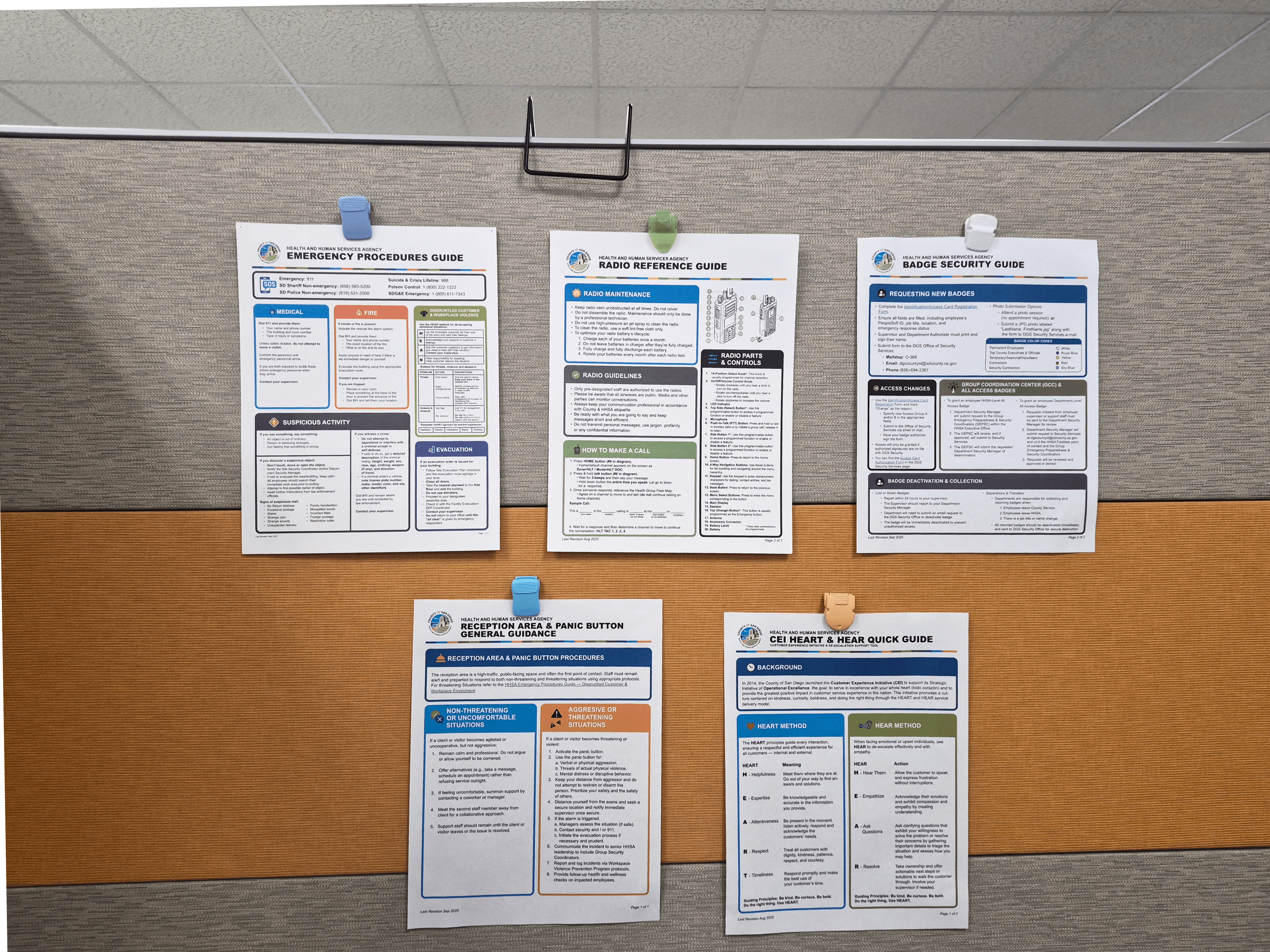
The ask was to take four separate internal resources and consolidate the most critical, regionally relevant emergency scenarios into a single 2-page reference guide that could live in every employee cubicle and common area across the agency.
That sounds simple. In practice it required:
Synthesizing content across multiple source documents with different voices, formats, and levels of currency.
Designing within San Diego County's established branding system, including the updated visual identity, approved color palette, and institutional tone.
Customizing iconography to be clear and accessible in a high-stress, time-sensitive context.
Writing and editing supporting content where source materials had gaps.
Navigating a rigorous multi-stage approval process involving directors, HR, and labor relations before anything could be finalized and distributed.
Government design isn't just about what looks good. It's about what survives the approval process, holds up under real use, and stays functional and relevant long after it's been distributed, potentially for years before it sees another update or major change.
The Wallet Version
The emergency guide was well-received enough that I was asked to apply the same approach to a growing set of agency reference materials:
Radio Guidelines Guide - Designed to support the agency's first radio system upgrade in 15 years. New equipment, new protocols, and a user base that would be working with these guidelines for the next 15 to 20 years before another update. The design had to be durable, clear, and built for an audience encountering the system fresh. Department-specific variants were created to reflect different operational contexts across the agency.
Employee Badge Guide - A quick-reference resource for badge procedures and access protocols, designed for clarity and everyday usability.
HEART Customer Support Guides - Reference materials supporting frontline staff in delivering consistent, high-quality constituent services.
Each guide went through its own multi-stakeholder review and approval process, with edits and sign-off from relevant departments, HR, and leadership. Maintaining design consistency across all materials while accommodating content changes through each approval cycle was its own design challenge.
One of the more considered design decisions was creating a wallet or badge-sized version of the emergency guide alongside the full 2-pager. The logic was straightforward: emergencies don't wait for someone to find a wall poster. People needed access to critical information on their person, in a format they could carry without thinking about it.
The wallet version required distilling an already-condensed document down to its absolute essentials, prioritizing the most time-sensitive actions in the smallest possible footprint without losing clarity or usability.

County-Wide Adoption
One of the more considered design decisions was creating a wallet or badge-sized version of the emergency guide alongside the full 2-pager. The logic was straightforward: emergencies don't wait for someone to find a wall poster. People needed access to critical information on their person, in a format they could carry without thinking about it.
The wallet version required distilling an already-condensed document down to its absolute essentials, prioritizing the most time-sensitive actions in the smallest possible footprint without losing clarity or usability.
The emergency guide was well-received enough that I was asked to apply the same approach to a growing set of agency reference materials:
Radio Guidelines Guide - Designed to support the agency's first radio system upgrade in 15 years. New equipment, new protocols, and a user base that would be working with these guidelines for the next 15 to 20 years before another update. The design had to be durable, clear, and built for an audience encountering the system fresh. Department-specific variants were created to reflect different operational contexts across the agency.
Employee Badge Guide - A quick-reference resource for badge procedures and access protocols, designed for clarity and everyday usability.
HEART Customer Support Guides - Reference materials supporting frontline staff in delivering consistent, high-quality constituent services.
Each guide went through its own multi-stakeholder review and approval process, with edits and sign-off from relevant departments, HR, and leadership. Maintaining design consistency across all materials while accommodating content changes through each approval cycle was its own design challenge.
From One Guide to a Design System
The emergency guide was well-received enough that I was asked to apply the same approach to a growing set of agency reference materials:
Radio Guidelines Guide - Designed to support the agency's first radio system upgrade in 15 years. New equipment, new protocols, and a user base that would be working with these guidelines for the next 15 to 20 years before another update. The design had to be durable, clear, and built for an audience encountering the system fresh. Department-specific variants were created to reflect different operational contexts across the agency.
Employee Badge Guide - A quick-reference resource for badge procedures and access protocols, designed for clarity and everyday usability.
HEART Customer Support Guides - Reference materials supporting frontline staff in delivering consistent, high-quality constituent services.
Each guide went through its own multi-stakeholder review and approval process, with edits and sign-off from relevant departments, HR, and leadership. Maintaining design consistency across all materials while accommodating content changes through each approval cycle was its own design challenge.
What started as an agency-level emergency resource was ultimately adopted across San Diego County as a standard template for critical reference materials.
The most significant application came with the CLEAR ordinance quick guide, developed as a resource for county employees navigating interactions with federal law enforcement during periods of heightened ICE activity in the region. Given that HHSA serves a large and diverse population including undocumented individuals and other vulnerable communities, this was high-stakes communication work. County employees needed clear, authoritative guidance they could access and act on quickly.
The fact that this template was trusted for that purpose reflects something important about what the original design got right: it was built to communicate clearly under pressure, inside the constraints of government systems, for people who needed it most.

What This Work Is Really About
County-Wide Adoption
What started as an agency-level emergency resource was ultimately adopted across San Diego County as a standard template for critical reference materials.
The most significant application came with the CLEAR ordinance quick guide, developed as a resource for county employees navigating interactions with federal law enforcement during periods of heightened ICE activity in the region. Given that HHSA serves a large and diverse population including undocumented individuals and other vulnerable communities, this was high-stakes communication work. County employees needed clear, authoritative guidance they could access and act on quickly.
The fact that this template was trusted for that purpose reflects something important about what the original design got right: it was built to communicate clearly under pressure, inside the constraints of government systems, for people who needed it most.

County-Wide Adoption
Reference guide design in government doesn't get a lot of attention as a design discipline. But done well, it is service design — taking complex, fragmented, institutionally-held information and making it usable for the people who need it, in the moment they need it, within the systems that have to approve and distribute it.
The earthquake that prompted this work was a reminder that design clarity is not just an aesthetic choice in a government context. It is a practical one. When the ground shakes, what's on the wall matters.


What This Work Is Really About
Reference guide design in government doesn't get a lot of attention as a design discipline. But done well, it is service design — taking complex, fragmented, institutionally-held information and making it usable for the people who need it, in the moment they need it, within the systems that have to approve and distribute it.
The earthquake that prompted this work was a reminder that design clarity is not just an aesthetic choice in a government context. It is a practical one. When the ground shakes, what's on the wall matters.
What This Work Is Really About
What started as an agency-level emergency resource was ultimately adopted across San Diego County as a standard template for critical reference materials.
The most significant application came with the CLEAR ordinance quick guide, developed as a resource for county employees navigating interactions with federal law enforcement during periods of heightened ICE activity in the region. Given that HHSA serves a large and diverse population including undocumented individuals and other vulnerable communities, this was high-stakes communication work. County employees needed clear, authoritative guidance they could access and act on quickly.
The fact that this template was trusted for that purpose reflects something important about what the original design got right: it was built to communicate clearly under pressure, inside the constraints of government systems, for people who needed it most.
Reference guide design in government doesn't get a lot of attention as a design discipline. But done well, it is service design — taking complex, fragmented, institutionally-held information and making it usable for the people who need it, in the moment they need it, within the systems that have to approve and distribute it.
The earthquake that prompted this work was a reminder that design clarity is not just an aesthetic choice in a government context. It is a practical one. When the ground shakes, what's on the wall matters.


County of San Diego Reference Guides
County of San Diego Reference Guides
From a 2-page guide to a county-wide design system.
From a 2-page guide to a county-wide design system.
My Role
Designer · Information Architect
Organization
Health and Human Services Agency, San Diego County
Deliverables
Reference Guides Design System
Focus
· Information design
· Govt branding
· Multi-stakeholder approval
Project Catalyst
In March 2025, a Magnitude 5.2 earthquake hit the San Diego county region. In the moments that followed, directors and senior managers across the agency found themselves uncertain about what to do, not because they were unprepared, but because the materials meant to guide them weren't accessible, weren't current, and in many cases weren't on the wall where they were supposed to be.
The audit that followed surfaced a challenge common across government agencies: critical information existed, but it was distributed across multiple documents, formatted inconsistently, and not optimized for fast, high-pressure retrieval. The opportunity was clear: consolidate, standardize, and redesign so that when the next event happened, the right information would be exactly where people needed it.
The Design Challenge
More than a formatting job
The ask was to take four separate internal resources and consolidate the most critical, regionally relevant emergency scenarios into a single 2-page reference guide that could live in every employee cubicle and common area across the agency.
That sounds simple. In practice it required:
Synthesizing content across multiple source documents with different voices, formats, and levels of currency.
Designing within San Diego County's established branding system, including the updated visual identity, approved color palette, and institutional tone.
Customizing iconography to be clear and accessible in a high-stress, time-sensitive context.
Writing and editing supporting content where source materials had gaps.
Navigating a rigorous multi-stage approval process involving directors, HR, and labor relations before anything could be finalized and distributed.
Government design isn't just about what looks good. It's about what survives the approval process, holds up under real use, and stays functional and relevant long after it's been distributed, potentially for years before it sees another update or major change.
The Wallet Version
The emergency guide was well-received enough that I was asked to apply the same approach to a growing set of agency reference materials:
Radio Guidelines Guide - Designed to support the agency's first radio system upgrade in 15 years. New equipment, new protocols, and a user base that would be working with these guidelines for the next 15 to 20 years before another update. The design had to be durable, clear, and built for an audience encountering the system fresh. Department-specific variants were created to reflect different operational contexts across the agency.
Employee Badge Guide - A quick-reference resource for badge procedures and access protocols, designed for clarity and everyday usability.
HEART Customer Support Guides - Reference materials supporting frontline staff in delivering consistent, high-quality constituent services.
Each guide went through its own multi-stakeholder review and approval process, with edits and sign-off from relevant departments, HR, and leadership. Maintaining design consistency across all materials while accommodating content changes through each approval cycle was its own design challenge.
One of the more considered design decisions was creating a wallet or badge-sized version of the emergency guide alongside the full 2-pager. The logic was straightforward: emergencies don't wait for someone to find a wall poster. People needed access to critical information on their person, in a format they could carry without thinking about it.
The wallet version required distilling an already-condensed document down to its absolute essentials, prioritizing the most time-sensitive actions in the smallest possible footprint without losing clarity or usability.
County-Wide Adoption
One of the more considered design decisions was creating a wallet or badge-sized version of the emergency guide alongside the full 2-pager. The logic was straightforward: emergencies don't wait for someone to find a wall poster. People needed access to critical information on their person, in a format they could carry without thinking about it.
The wallet version required distilling an already-condensed document down to its absolute essentials, prioritizing the most time-sensitive actions in the smallest possible footprint without losing clarity or usability.
The emergency guide was well-received enough that I was asked to apply the same approach to a growing set of agency reference materials:
Radio Guidelines Guide - Designed to support the agency's first radio system upgrade in 15 years. New equipment, new protocols, and a user base that would be working with these guidelines for the next 15 to 20 years before another update. The design had to be durable, clear, and built for an audience encountering the system fresh. Department-specific variants were created to reflect different operational contexts across the agency.
Employee Badge Guide - A quick-reference resource for badge procedures and access protocols, designed for clarity and everyday usability.
HEART Customer Support Guides - Reference materials supporting frontline staff in delivering consistent, high-quality constituent services.
Each guide went through its own multi-stakeholder review and approval process, with edits and sign-off from relevant departments, HR, and leadership. Maintaining design consistency across all materials while accommodating content changes through each approval cycle was its own design challenge.
From One Guide to a Design System
The emergency guide was well-received enough that I was asked to apply the same approach to a growing set of agency reference materials:
Radio Guidelines Guide - Designed to support the agency's first radio system upgrade in 15 years. New equipment, new protocols, and a user base that would be working with these guidelines for the next 15 to 20 years before another update. The design had to be durable, clear, and built for an audience encountering the system fresh. Department-specific variants were created to reflect different operational contexts across the agency.
Employee Badge Guide - A quick-reference resource for badge procedures and access protocols, designed for clarity and everyday usability.
HEART Customer Support Guides - Reference materials supporting frontline staff in delivering consistent, high-quality constituent services.
Each guide went through its own multi-stakeholder review and approval process, with edits and sign-off from relevant departments, HR, and leadership. Maintaining design consistency across all materials while accommodating content changes through each approval cycle was its own design challenge.
What started as an agency-level emergency resource was ultimately adopted across San Diego County as a standard template for critical reference materials.
The most significant application came with the CLEAR ordinance quick guide, developed as a resource for county employees navigating interactions with federal law enforcement during periods of heightened ICE activity in the region. Given that HHSA serves a large and diverse population including undocumented individuals and other vulnerable communities, this was high-stakes communication work. County employees needed clear, authoritative guidance they could access and act on quickly.
The fact that this template was trusted for that purpose reflects something important about what the original design got right: it was built to communicate clearly under pressure, inside the constraints of government systems, for people who needed it most.
What This Work Is Really About
County-Wide Adoption
What started as an agency-level emergency resource was ultimately adopted across San Diego County as a standard template for critical reference materials.
The most significant application came with the CLEAR ordinance quick guide, developed as a resource for county employees navigating interactions with federal law enforcement during periods of heightened ICE activity in the region. Given that HHSA serves a large and diverse population including undocumented individuals and other vulnerable communities, this was high-stakes communication work. County employees needed clear, authoritative guidance they could access and act on quickly.
The fact that this template was trusted for that purpose reflects something important about what the original design got right: it was built to communicate clearly under pressure, inside the constraints of government systems, for people who needed it most.
County-Wide Adoption
Reference guide design in government doesn't get a lot of attention as a design discipline. But done well, it is service design — taking complex, fragmented, institutionally-held information and making it usable for the people who need it, in the moment they need it, within the systems that have to approve and distribute it.
The earthquake that prompted this work was a reminder that design clarity is not just an aesthetic choice in a government context. It is a practical one. When the ground shakes, what's on the wall matters.
What This Work Is Really About
What started as an agency-level emergency resource was ultimately adopted across San Diego County as a standard template for critical reference materials.
The most significant application came with the CLEAR ordinance quick guide, developed as a resource for county employees navigating interactions with federal law enforcement during periods of heightened ICE activity in the region. Given that HHSA serves a large and diverse population including undocumented individuals and other vulnerable communities, this was high-stakes communication work. County employees needed clear, authoritative guidance they could access and act on quickly.
The fact that this template was trusted for that purpose reflects something important about what the original design got right: it was built to communicate clearly under pressure, inside the constraints of government systems, for people who needed it most.
Reference guide design in government doesn't get a lot of attention as a design discipline. But done well, it is service design — taking complex, fragmented, institutionally-held information and making it usable for the people who need it, in the moment they need it, within the systems that have to approve and distribute it.
The earthquake that prompted this work was a reminder that design clarity is not just an aesthetic choice in a government context. It is a practical one. When the ground shakes, what's on the wall matters.
County of San Diego Reference Guides
County of San Diego Reference Guides
From a 2-page guide to a county-wide design system.
From a 2-page guide to a county-wide design system.
My Role
Designer · Information Architect
Organization
Health and Human Services Agency, San Diego County
Deliverables
Reference Guides Design System
Focus
· Information design
· Govt branding
· Multi-stakeholder approval
Project Catalyst
In March 2025, a Magnitude 5.2 earthquake hit the San Diego county region. In the moments that followed, directors and senior managers across the agency found themselves uncertain about what to do, not because they were unprepared, but because the materials meant to guide them weren't accessible, weren't current, and in many cases weren't on the wall where they were supposed to be.
The audit that followed surfaced a challenge common across government agencies: critical information existed, but it was distributed across multiple documents, formatted inconsistently, and not optimized for fast, high-pressure retrieval. The opportunity was clear: consolidate, standardize, and redesign so that when the next event happened, the right information would be exactly where people needed it.
The Design Challenge
More than a formatting job
The ask was to take four separate internal resources and consolidate the most critical, regionally relevant emergency scenarios into a single 2-page reference guide that could live in every employee cubicle and common area across the agency.
That sounds simple. In practice it required:
Synthesizing content across multiple source documents with different voices, formats, and levels of currency.
Designing within San Diego County's established branding system, including the updated visual identity, approved color palette, and institutional tone.
Customizing iconography to be clear and accessible in a high-stress, time-sensitive context.
Writing and editing supporting content where source materials had gaps.
Navigating a rigorous multi-stage approval process involving directors, HR, and labor relations before anything could be finalized and distributed.
Government design isn't just about what looks good. It's about what survives the approval process, holds up under real use, and stays functional and relevant long after it's been distributed, potentially for years before it sees another update or major change.
The Wallet Version
The emergency guide was well-received enough that I was asked to apply the same approach to a growing set of agency reference materials:
Radio Guidelines Guide - Designed to support the agency's first radio system upgrade in 15 years. New equipment, new protocols, and a user base that would be working with these guidelines for the next 15 to 20 years before another update. The design had to be durable, clear, and built for an audience encountering the system fresh. Department-specific variants were created to reflect different operational contexts across the agency.
Employee Badge Guide - A quick-reference resource for badge procedures and access protocols, designed for clarity and everyday usability.
HEART Customer Support Guides - Reference materials supporting frontline staff in delivering consistent, high-quality constituent services.
Each guide went through its own multi-stakeholder review and approval process, with edits and sign-off from relevant departments, HR, and leadership. Maintaining design consistency across all materials while accommodating content changes through each approval cycle was its own design challenge.
One of the more considered design decisions was creating a wallet or badge-sized version of the emergency guide alongside the full 2-pager. The logic was straightforward: emergencies don't wait for someone to find a wall poster. People needed access to critical information on their person, in a format they could carry without thinking about it.
The wallet version required distilling an already-condensed document down to its absolute essentials, prioritizing the most time-sensitive actions in the smallest possible footprint without losing clarity or usability.
County-Wide Adoption
One of the more considered design decisions was creating a wallet or badge-sized version of the emergency guide alongside the full 2-pager. The logic was straightforward: emergencies don't wait for someone to find a wall poster. People needed access to critical information on their person, in a format they could carry without thinking about it.
The wallet version required distilling an already-condensed document down to its absolute essentials, prioritizing the most time-sensitive actions in the smallest possible footprint without losing clarity or usability.
One of the more considered design decisions was creating a wallet or badge-sized version of the emergency guide alongside the full 2-pager. The logic was straightforward: emergencies don't wait for someone to find a wall poster. People needed access to critical information on their person, in a format they could carry without thinking about it.
The wallet version required distilling an already-condensed document down to its absolute essentials, prioritizing the most time-sensitive actions in the smallest possible footprint without losing clarity or usability.
One of the more considered design decisions was creating a wallet or badge-sized version of the emergency guide alongside the full 2-pager. The logic was straightforward: emergencies don't wait for someone to find a wall poster. People needed access to critical information on their person, in a format they could carry without thinking about it.
The wallet version required distilling an already-condensed document down to its absolute essentials, prioritizing the most time-sensitive actions in the smallest possible footprint without losing clarity or usability.
The emergency guide was well-received enough that I was asked to apply the same approach to a growing set of agency reference materials:
Radio Guidelines Guide - Designed to support the agency's first radio system upgrade in 15 years. New equipment, new protocols, and a user base that would be working with these guidelines for the next 15 to 20 years before another update. The design had to be durable, clear, and built for an audience encountering the system fresh. Department-specific variants were created to reflect different operational contexts across the agency.
Employee Badge Guide - A quick-reference resource for badge procedures and access protocols, designed for clarity and everyday usability.
HEART Customer Support Guides - Reference materials supporting frontline staff in delivering consistent, high-quality constituent services.
Each guide went through its own multi-stakeholder review and approval process, with edits and sign-off from relevant departments, HR, and leadership. Maintaining design consistency across all materials while accommodating content changes through each approval cycle was its own design challenge.
From One Guide to a Design System
The emergency guide was well-received enough that I was asked to apply the same approach to a growing set of agency reference materials:
Radio Guidelines Guide - Designed to support the agency's first radio system upgrade in 15 years. New equipment, new protocols, and a user base that would be working with these guidelines for the next 15 to 20 years before another update. The design had to be durable, clear, and built for an audience encountering the system fresh. Department-specific variants were created to reflect different operational contexts across the agency.
Employee Badge Guide - A quick-reference resource for badge procedures and access protocols, designed for clarity and everyday usability.
HEART Customer Support Guides - Reference materials supporting frontline staff in delivering consistent, high-quality constituent services.
Each guide went through its own multi-stakeholder review and approval process, with edits and sign-off from relevant departments, HR, and leadership. Maintaining design consistency across all materials while accommodating content changes through each approval cycle was its own design challenge.
What started as an agency-level emergency resource was ultimately adopted across San Diego County as a standard template for critical reference materials.
The most significant application came with the CLEAR ordinance quick guide, developed as a resource for county employees navigating interactions with federal law enforcement during periods of heightened ICE activity in the region. Given that HHSA serves a large and diverse population including undocumented individuals and other vulnerable communities, this was high-stakes communication work. County employees needed clear, authoritative guidance they could access and act on quickly.
The fact that this template was trusted for that purpose reflects something important about what the original design got right: it was built to communicate clearly under pressure, inside the constraints of government systems, for people who needed it most.
What This Work Is Really About
County-Wide Adoption
What started as an agency-level emergency resource was ultimately adopted across San Diego County as a standard template for critical reference materials.
The most significant application came with the CLEAR ordinance quick guide, developed as a resource for county employees navigating interactions with federal law enforcement during periods of heightened ICE activity in the region. Given that HHSA serves a large and diverse population including undocumented individuals and other vulnerable communities, this was high-stakes communication work. County employees needed clear, authoritative guidance they could access and act on quickly.
The fact that this template was trusted for that purpose reflects something important about what the original design got right: it was built to communicate clearly under pressure, inside the constraints of government systems, for people who needed it most.
County-Wide Adoption
Reference guide design in government doesn't get a lot of attention as a design discipline. But done well, it is service design — taking complex, fragmented, institutionally-held information and making it usable for the people who need it, in the moment they need it, within the systems that have to approve and distribute it.
The earthquake that prompted this work was a reminder that design clarity is not just an aesthetic choice in a government context. It is a practical one. When the ground shakes, what's on the wall matters.
What This Work Is Really About
Reference guide design in government doesn't get a lot of attention as a design discipline. But done well, it is service design — taking complex, fragmented, institutionally-held information and making it usable for the people who need it, in the moment they need it, within the systems that have to approve and distribute it.
The earthquake that prompted this work was a reminder that design clarity is not just an aesthetic choice in a government context. It is a practical one. When the ground shakes, what's on the wall matters.
What This Work Is Really About
What started as an agency-level emergency resource was ultimately adopted across San Diego County as a standard template for critical reference materials.
The most significant application came with the CLEAR ordinance quick guide, developed as a resource for county employees navigating interactions with federal law enforcement during periods of heightened ICE activity in the region. Given that HHSA serves a large and diverse population including undocumented individuals and other vulnerable communities, this was high-stakes communication work. County employees needed clear, authoritative guidance they could access and act on quickly.
The fact that this template was trusted for that purpose reflects something important about what the original design got right: it was built to communicate clearly under pressure, inside the constraints of government systems, for people who needed it most.
Reference guide design in government doesn't get a lot of attention as a design discipline. But done well, it is service design — taking complex, fragmented, institutionally-held information and making it usable for the people who need it, in the moment they need it, within the systems that have to approve and distribute it.
The earthquake that prompted this work was a reminder that design clarity is not just an aesthetic choice in a government context. It is a practical one. When the ground shakes, what's on the wall matters.